


Work for a design studio specializing in working with small businesses.
Disciplines: Branding, Digital Ads, Print Design, Web Design, Project Management
Completion Date: Ongoing
Having a new project come through for Steve Stone was always exciting at BDG. Steve is a voiceover artist that always loves abstracted, high-theory campaigns. Our most off-the-wall ideas were always his first choice. Brainstorming sessions for our next ad concepts were always wild, and it was a joy knowing that if we could execute on it, Steve would be sold.
The first set of ads for Steve was the result of him talking to us about portraying his voice as "a little fresh, and a little familiar" at the same time. We thought the idea of a fresh fruit could be interesting, using Steve's logo on the sticker you always peel off when you get home. I particularly like how the oversaturated colors in the fruit and the background make even something as familiar as an orange feel "unique."
Our next set of ads with Steve, again, started with a conversation about what we wanted to portray to his potential clients. This time, it was the unique personality that he brought to a project. Having worked with him, I can attest to this being a great selling point of working with Steve. We discussed a variety of concepts, including one playing heavily on his first name, using the copy "A Great Perstoneality." We liked this idea paired with a goofy, memorable pet rock (or pet stone). Steve fell in love with the idea immediately, and after some iteration on exactly what the little guy looked like, it was all over for any other concepts for a bit.
I think these apparel collections really pushed me outside of what I would have initially thought I could excel at. These were eye-opening processes to show myself exactly what my skills as a designer could be used for with unique projects that I hadn’t necessarily tackled before.
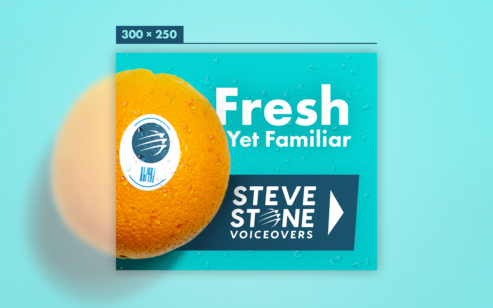
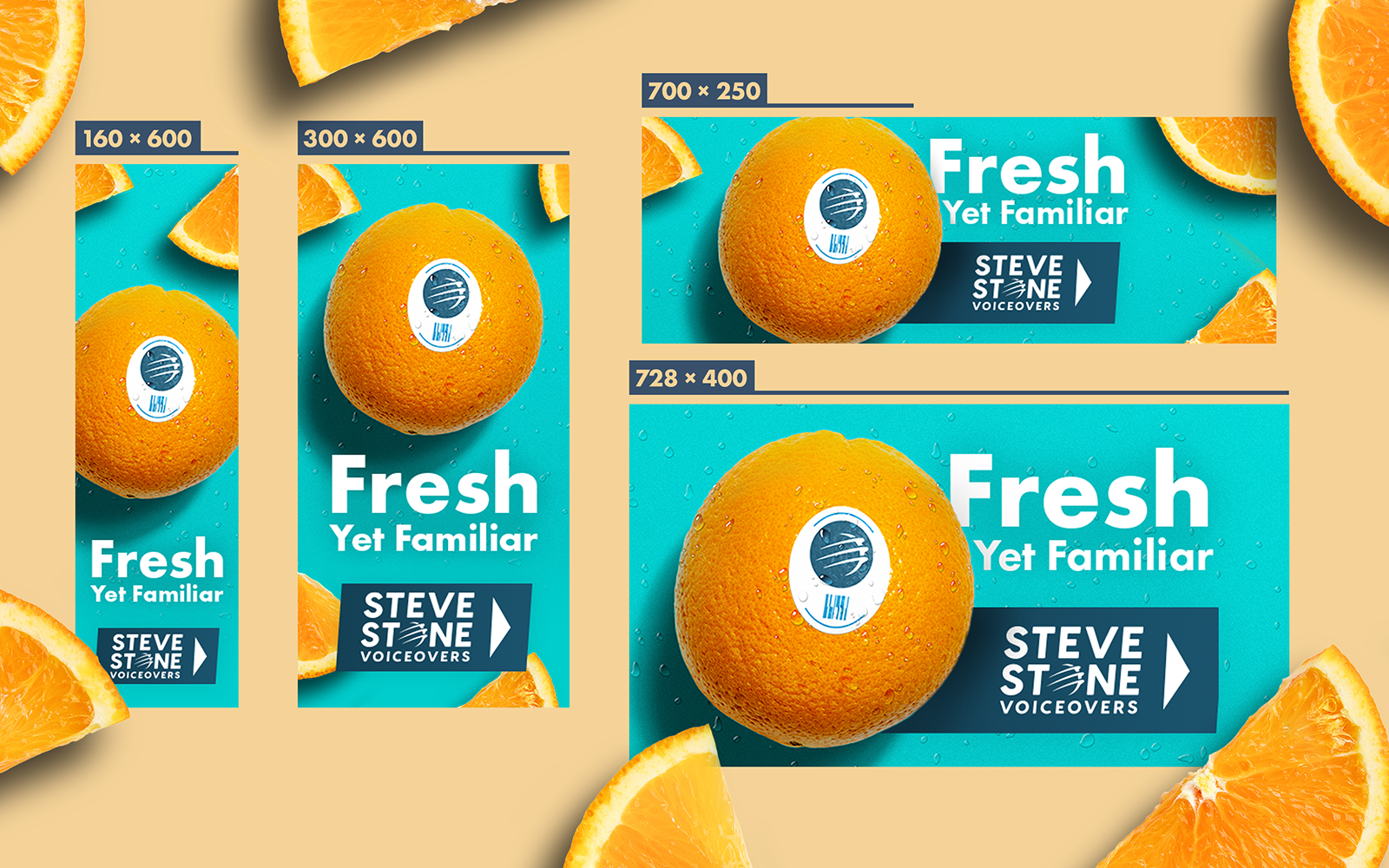
"Fresh" ad campaign.
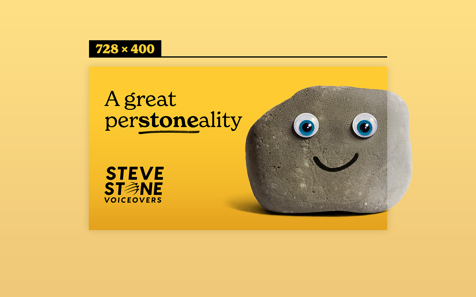
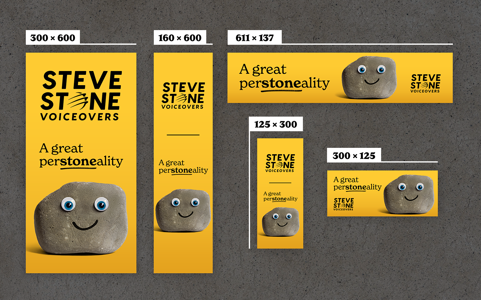
"Pet Rock" ad campaign.
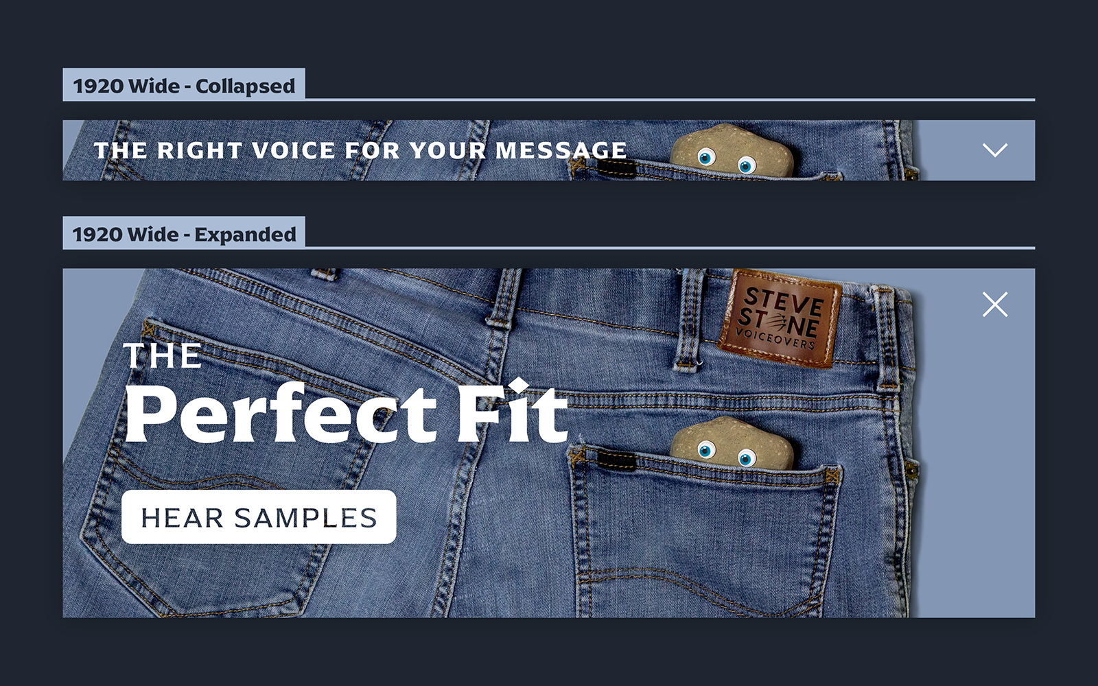
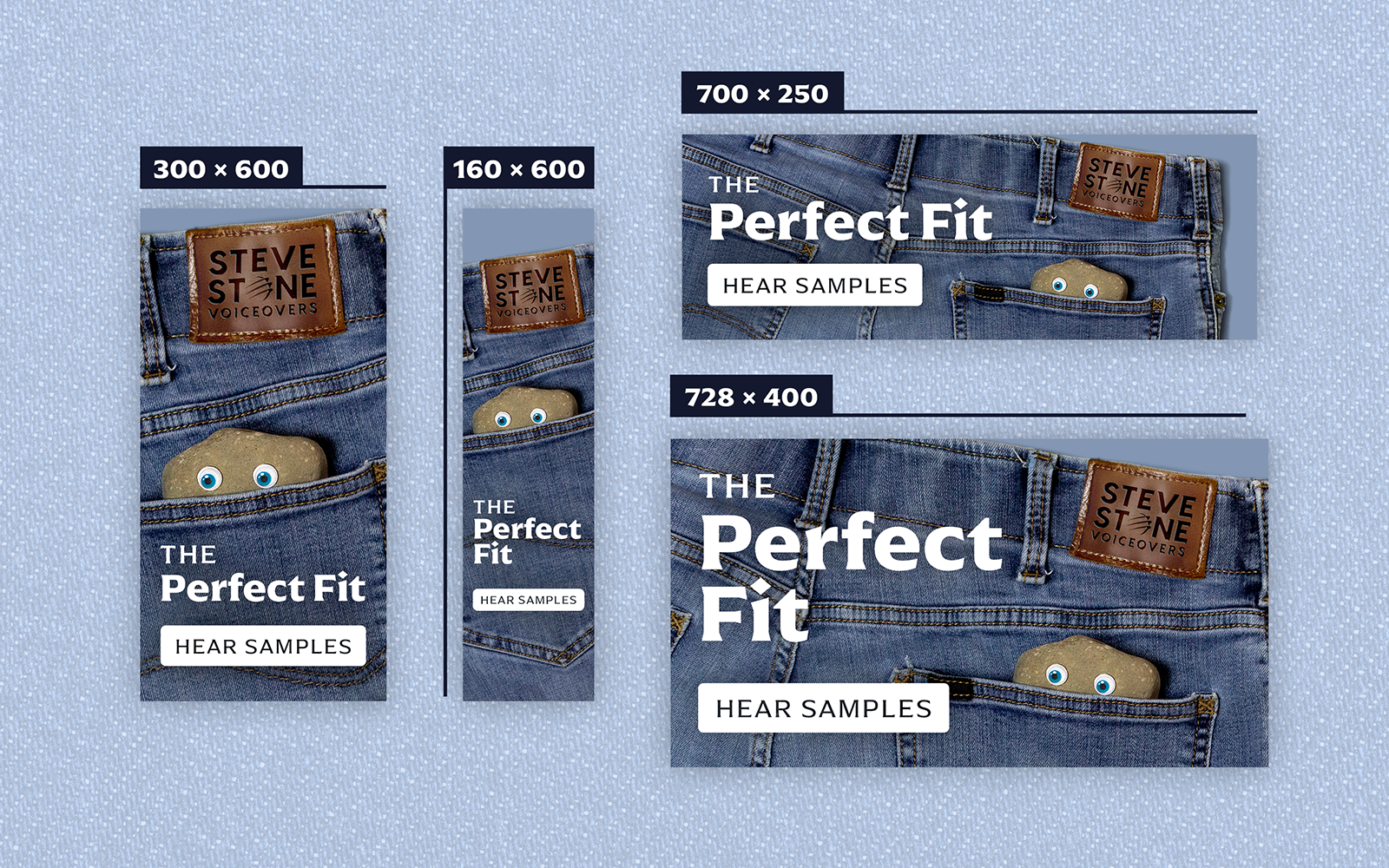
"Perfect Fit" ad campaign.
Brighton Music Center provides music lessons and service to western Pennsylvania with a long history in the area. They have a long working relationship with BDG, and came to us requesting some templates for social media graphics. Their branded elements were a bit sparse, with really just a logo and a particular shade of red to work with, so it was a good canvas to expand that into some new elements to use in practice. In these templates, we reused the music staff in their logo as a fun border in various formats throughout the post graphics, and we put a focus on oldstyle serif fonts used in light weights for the typography.
BMC was really happy with these templates. After a few months of these templates being in their hands, we proposed a new brand expansion project to them. This project would include an updated version of their existing logo in a variety of layouts, a new brand pattern, an updated color palette, updated typography, and style sheet that covered all of these items.
BMC had a serviceable logo, but it was difficult for them to use it in a variety of formats. For example, their social media profiles used a logo with no relation at all to their “actual” logo. This would be updated every year noting how long they had been in business. In addition, the smaller serif font in the logo was a skewed version of an upright, non-italicized font, which often distorts letterforms. We updated this in all layouts of their logo that they would be getting with this expansion. We also included a version that included the year of their founding, eliminating the need to create a new, unbranded social media icon every year.
The typography and brand pattern both worked toward representing how BMC actively combines their storied history in Pennsylvania with a fun-loving staff and a modern, friendly approach to music. The typography combines the oldstyle serif from the logo with a clean, modern sans for body copy. The pattern uses several measures of Johannes Brahms’ Intermezzo to create a repeatable pattern with use cases as a background, a foreground, and a textured block of red. The color palette married the logo colors with a new deep brown and some other swatches that we used in their social media templates.
By the time BMC had the final style sheet in their hands, they were overjoyed with not only the work that we had done, but the thought process behind it. From initial meetings with them, it was clear that they were a fun-loving local group that wanted to bring a bit of their history to their current way of operating. Being able to help them do so visually was a joy to work on.
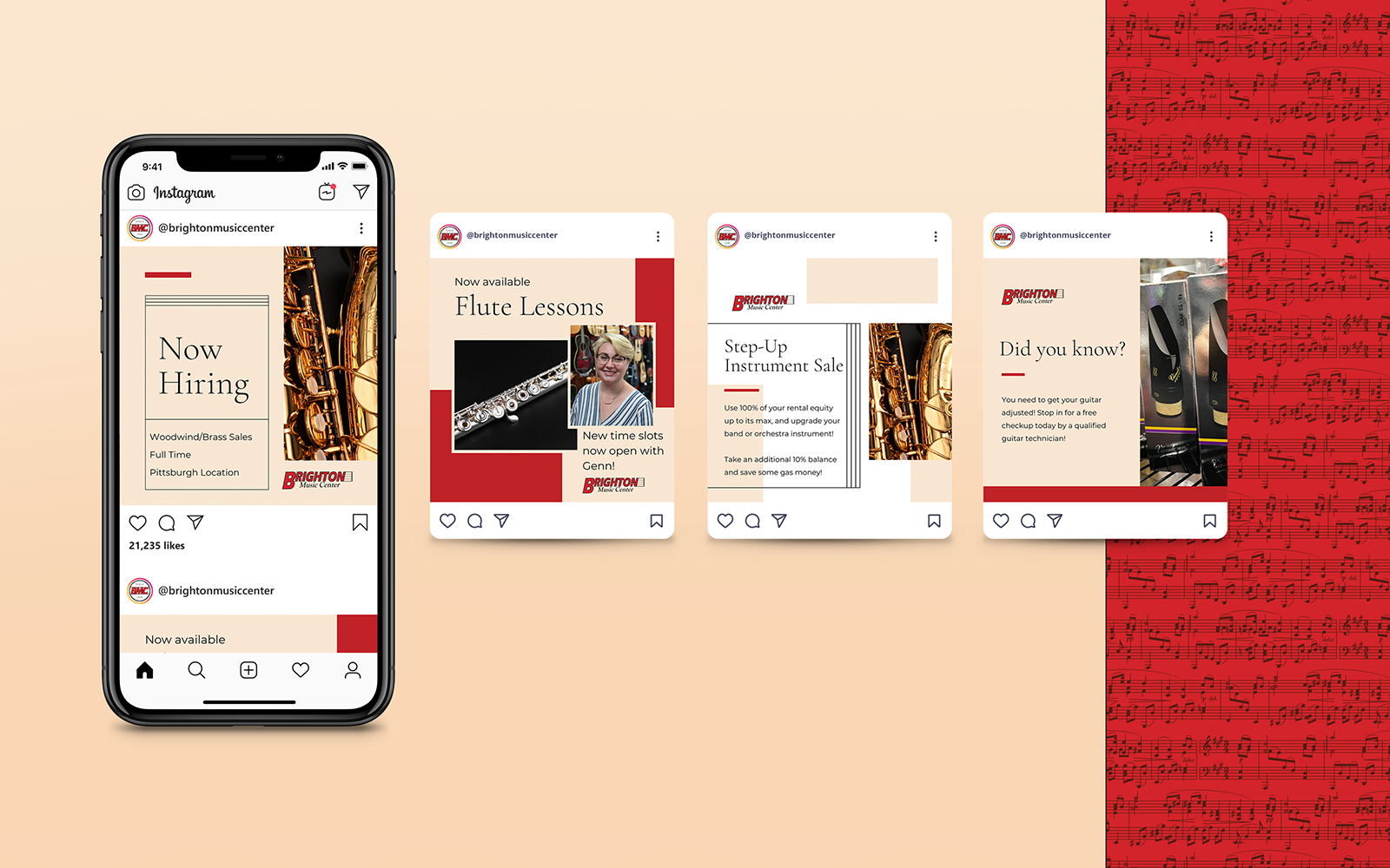
Canva template designs for a variety of post types.
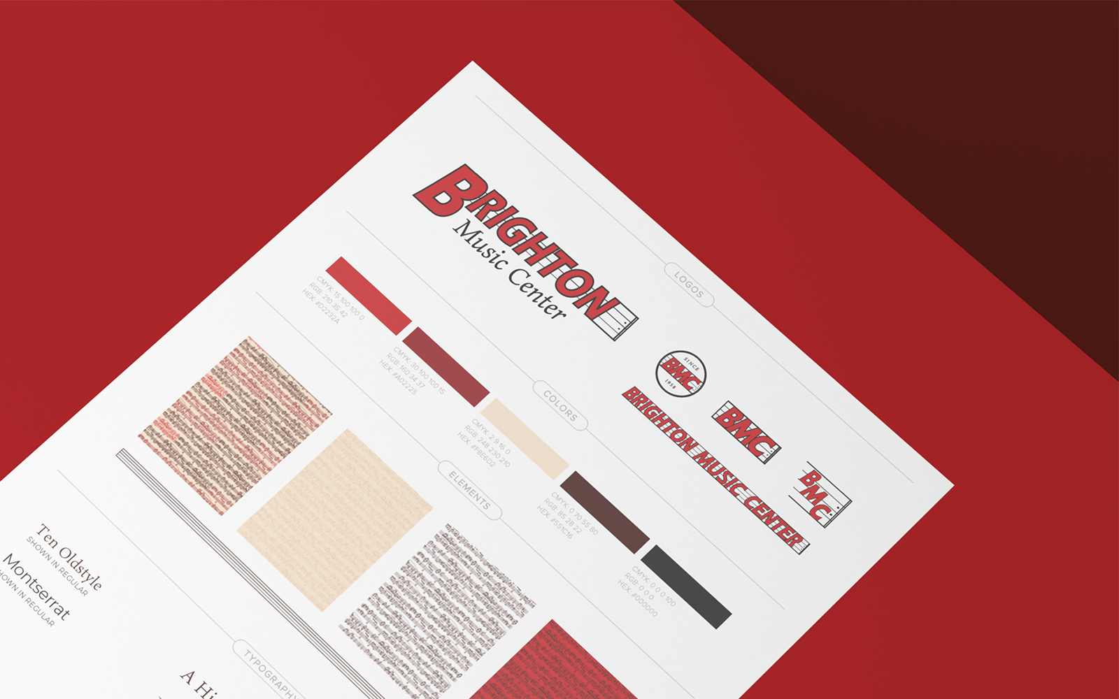
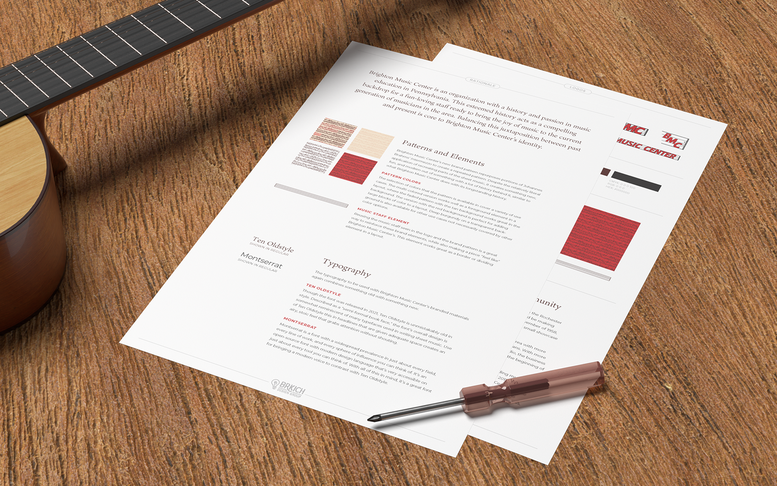
Logo variations, brand patterns, brand colors, and typography in BMC's style sheet.
OT Toolbox provides occupational therapy activities and resources to therapists, teachers, and parents. One of the ways they do this is through subscription services that provide a variety of resources at two different tiers: Level 1 and Level 2.
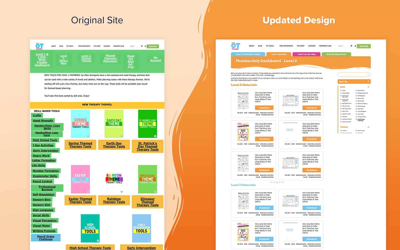
Prior to our work on these subscription models, each material would be uploaded multiple times and manually linked everywhere that it would need to appear according to its material type, upload date, and a variety of other criteria. Not only was this confusing for the sole manager of the materials, but it made things very confusing for users to navigate, as well.
We proposed a filter-based solution that would benefit both the site admin and the end-user. Uploading a new tool to the site would only need to happen once, and users would be able to search for exactly what they needed using the new filters. The original design of the subscription services needed some work, as well. Overall it felt like a completely place site than the other pages on OT Toolboxes site. The subscription pages were also very dated overall. We took the opportunity to reintroduce elements of the main site, such as the solid blocks of color, the wavy, illustrated borders, and the unique heading font, back into the subscription services.
The client was blown away with the update, and ended the project excited to see how much these changes would help occupational therapists, educators, parents, and kids
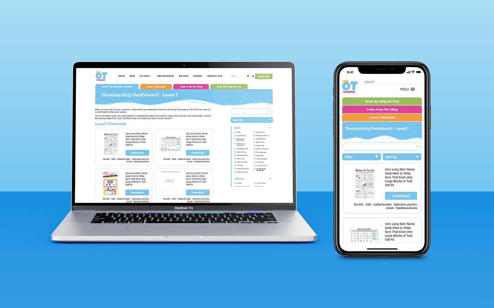
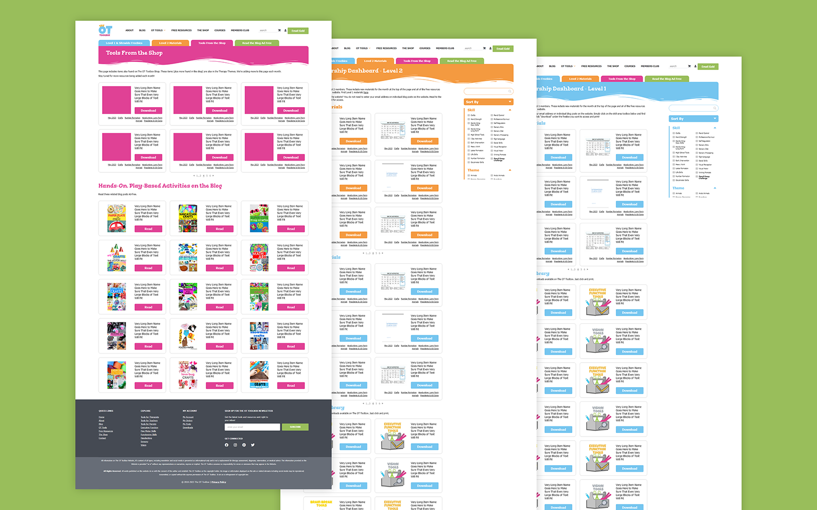
Various web pages that we designed for OT Toolbox's tiered subscription service.
The Live Donor Project is a community that helps match donors and recipients, provide support to both parties, and provide more information on the process as a whole. They initially purchased a Quick Launch Site with BDG, a product in which we use preset layouts to quickly design branded websites for clients. However, as we began onboarding, they expressed interest in branding from us, as well. They had a few logos that they were unhappy with, but certainly nothing that they’d feel confident moving forward with.
The biggest challenge with TLDP’s branding was the turnaround time. We wanted to stay on-track for the Quick Launch Site to go live as we had originally planned. Because of that, we needed to have a general brand direction in place by the time they got the website’s content to us, roughly a week after starting work on their project. I was getting flashbacks to my 50 Days of Logos project!
In addition, we’d also be providing a business card design and style sheet to them at some point. To accomplish all of this, I delegated work on the website design to one of our talented designers, Amelia Markey, while I worked through the branded elements. I’d be able to get her the assets she’d need to move forward on the website, and we’d be able to split off to cover more ground on the project and have it finished on time.
The overall brief for the branding had an overarching focus on key themes of community, life, support, and celebration that were relevant to TLDP. They had previously toyed with the idea of a tree. I thought this was a good idea, given how trees represent life and bring positive effects to their environment, but I wanted to be sure that we avoided looking like a landscaping company. The option that we landed on involves heavily abstracting this idea of a tree into basic geometric shapes. These strong, flat lines bring a level of trust to the logo, as well.
The typography and color palette both work together to create an inclusive, welcoming atmosphere, making sure everyone knows that they could provide the gift of life to a live donation recipient. The business card option carried these elements over, using the brand pattern as a block of “color” in a similar manner to how Amelia used it on their website. Before we knew it, we had the style guide out the door and the project complete. This project ended up being a whirlwind of work, and I’m really proud of the work that we were able to put together, specifically as a team at BDG.
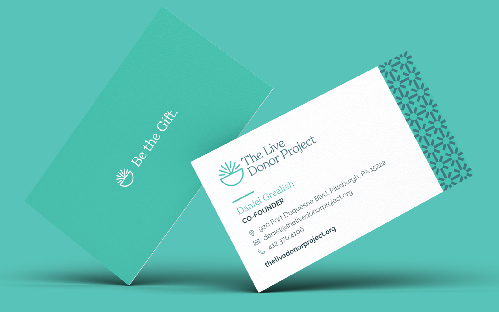
Business card design
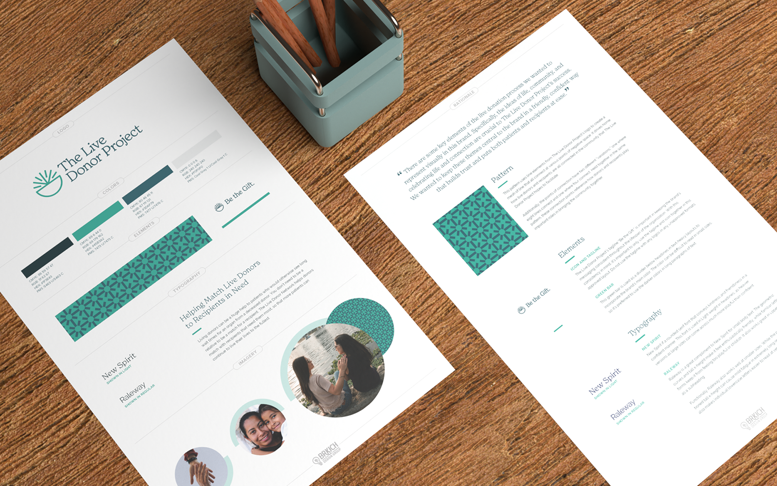
Brand style sheet.
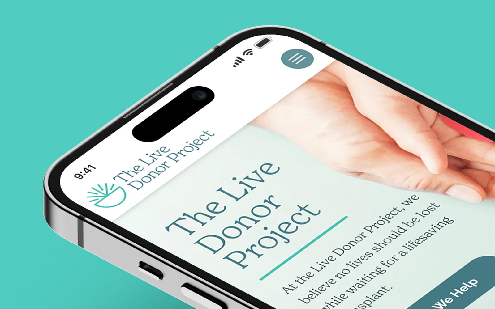
Logo shown in website designed by Amelia Markey.
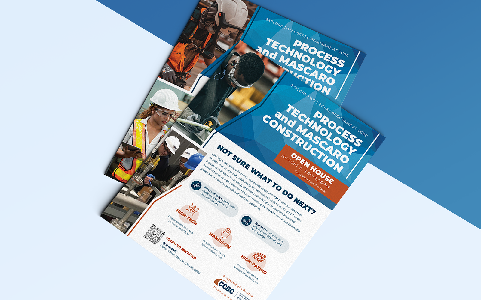
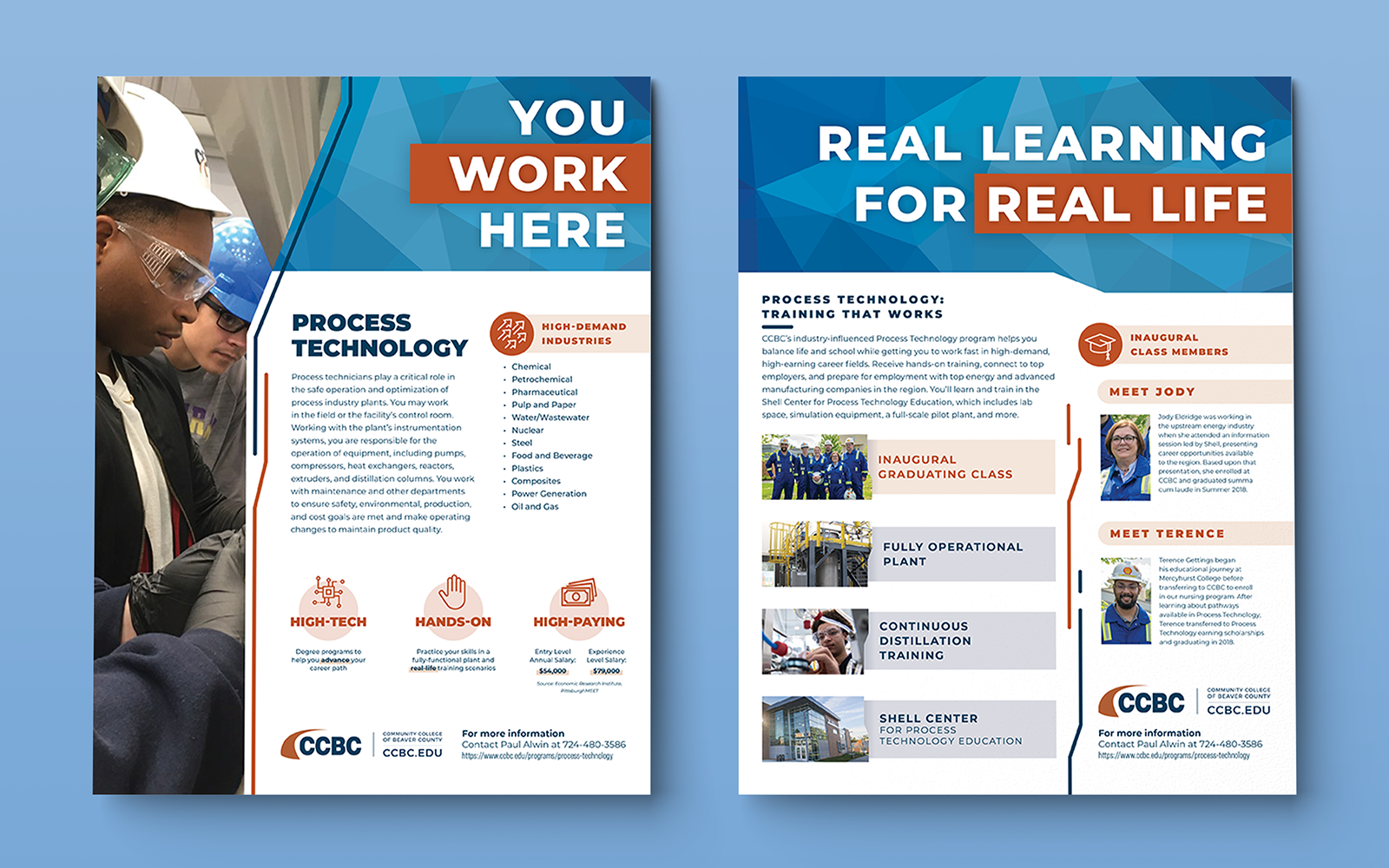
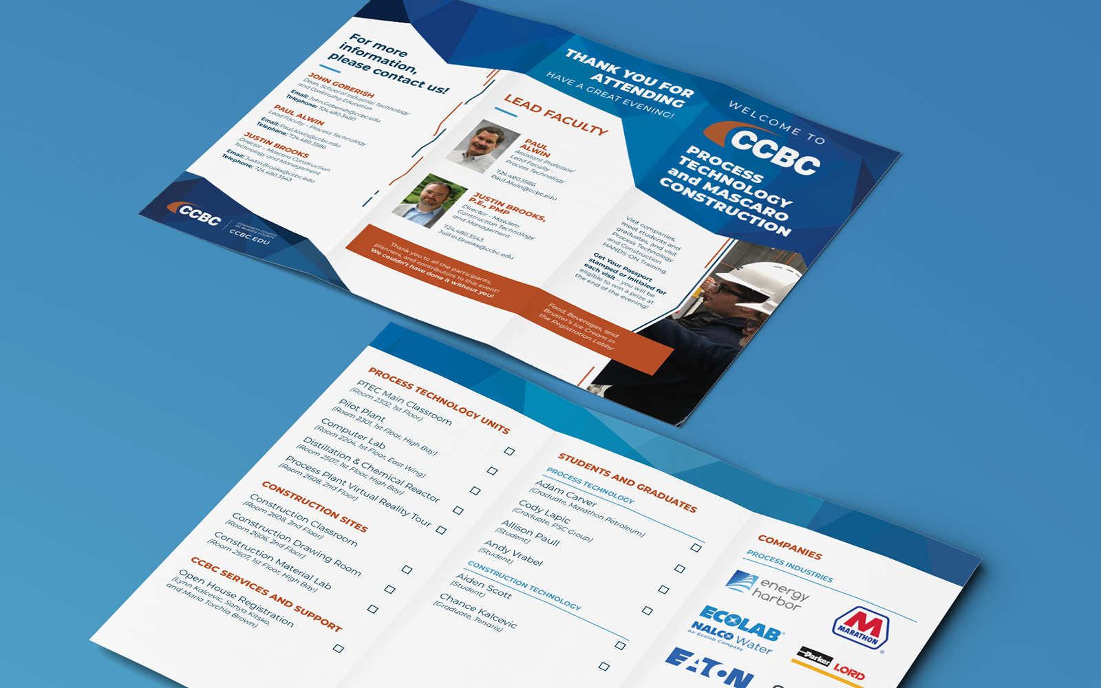
Various promotional material for the Community College of Beaver County.
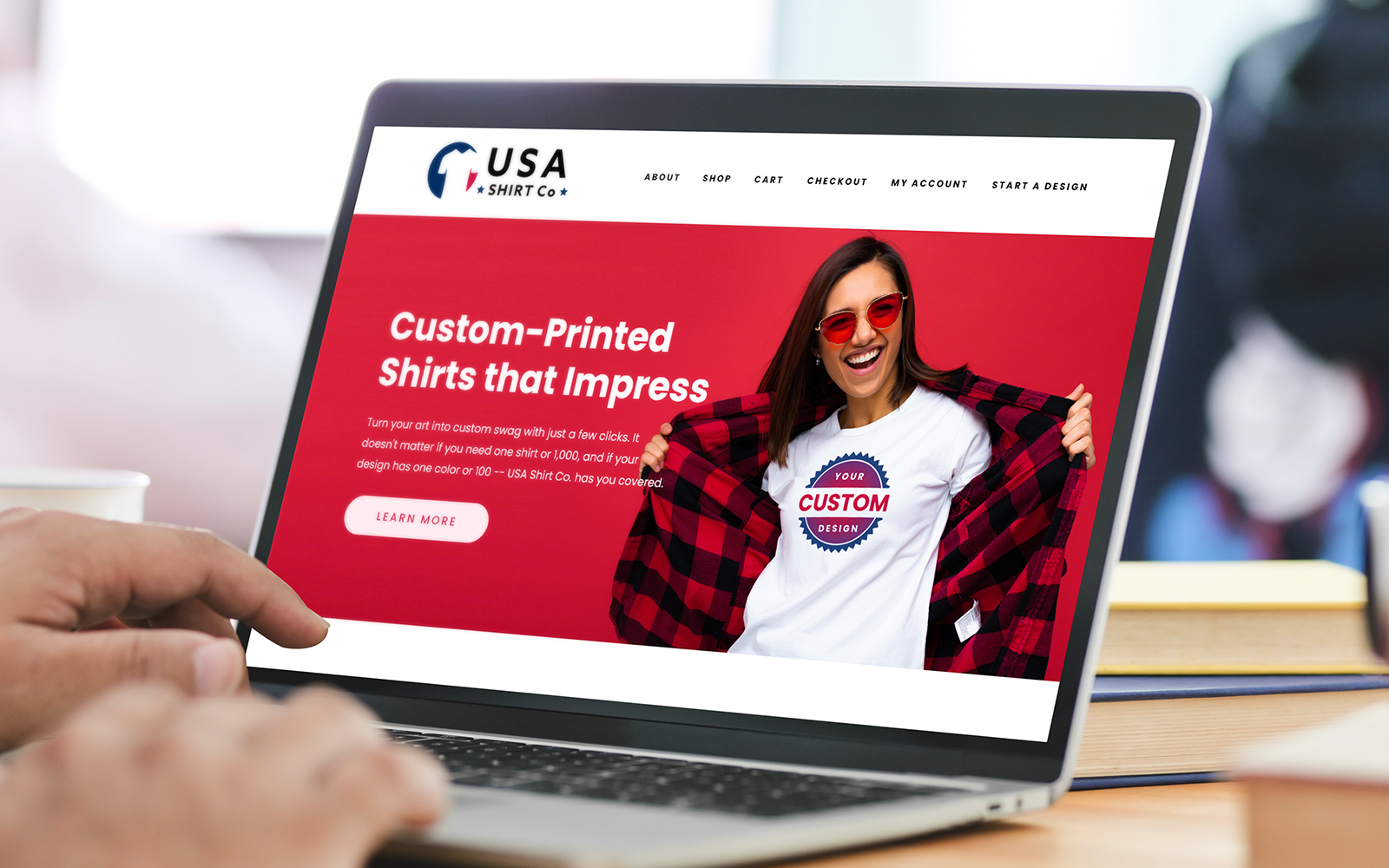
Quick Launch website for a t-shirt printing company.


